01 / The starting point
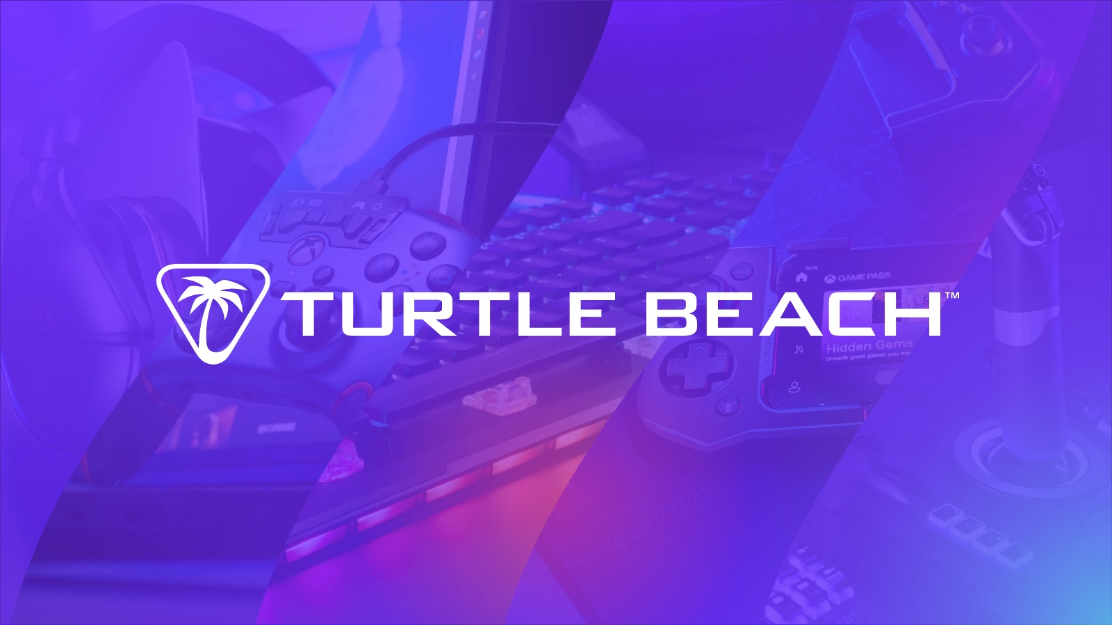
We worked with the Turtle Beach creative team on how to connect a broad product range around the existing logo. One decision was to give Turtle Beach a color it could use consistently across packaging, campaigns and retail, even as the platform cues changed.
The work needed to serve the buyer choosing a product, the marketing team building a campaign and the sales team presenting the range.
02 / One identity, many uses
Our consultation considered how the existing logo could anchor a broader, consistent visual system across different formats.
Product naming, typography and backgrounds extend that identity beyond the logo into a shared visual language.
03 / Color with a job to do
We recommended Royal Purple (#7538FF) because it gave Turtle Beach a distinct position alongside the signature colors of Corsair, Razer and Logitech G. Its saturated, electric tone felt at home alongside the bright accents and dark surfaces in gaming hardware. Repeating the same purple across products gave Turtle Beach a recognizable cue of its own.
Platform colors add another layer of information: green for Xbox, blue for PlayStation, red for Nintendo Switch and charcoal for multi-platform. Our packaging concepts explored how those signals could carry across packaging and assets.
04 / The brand today
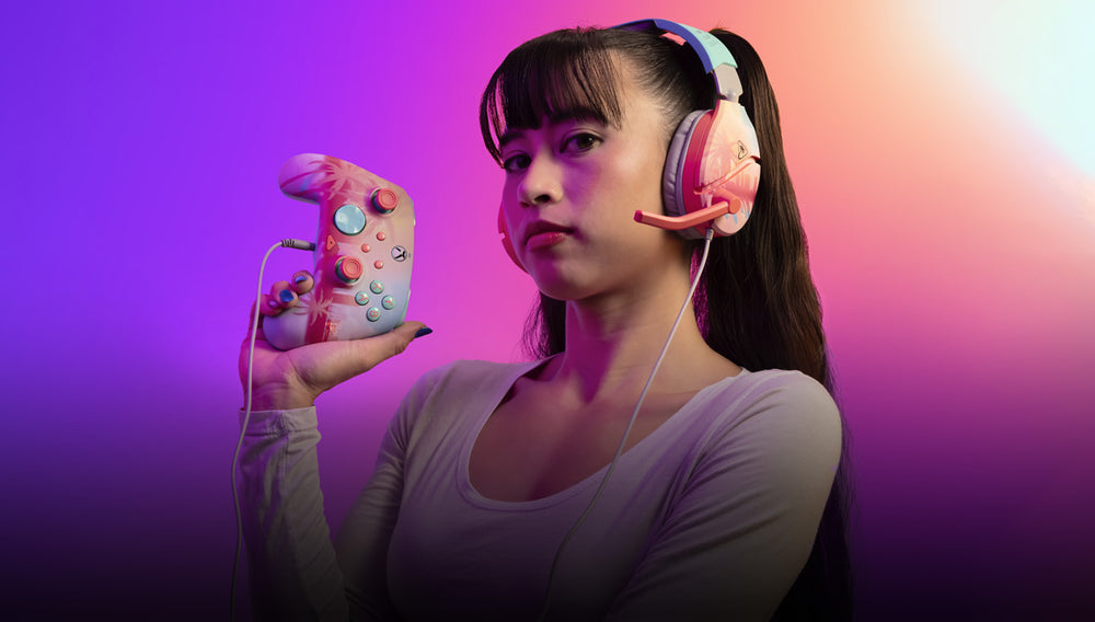
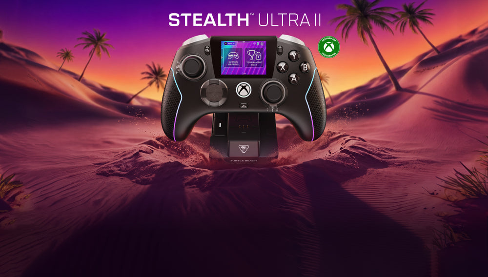
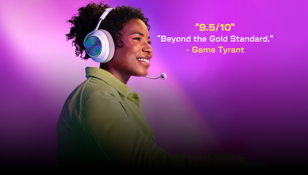
Purple connects product storytelling, environments and lifestyle imagery across Turtle Beach’s current campaigns.
05 / A distinct brand within the family
Victrix has its own premium gaming identity and visual world. Its case study goes deeper into that work while keeping the connection to Turtle Beach clear.
Explore Victrix →Agency: Show-More. Art direction and rebrand consultation: Nick Foster, with the Turtle Beach creative team.
Current campaign imagery:
Turtle Beach.