01 / The estate brief
Lennon’s image already carried decades of meaning through his solo work, magazine portraits and public tributes. The estate needed a shared reference for licensing, anniversaries and partner communications. Each of those settings calls for a different story, even when the subject is the same.
At Berman Design Group, I developed the estate brand guide, including its visual identity and the Gimme Some Truth art direction shown here. The guide brought the estate’s visual treatment and examples of Lennon’s wider cultural presence into one document.
02 / Art directing Gimme Some Truth
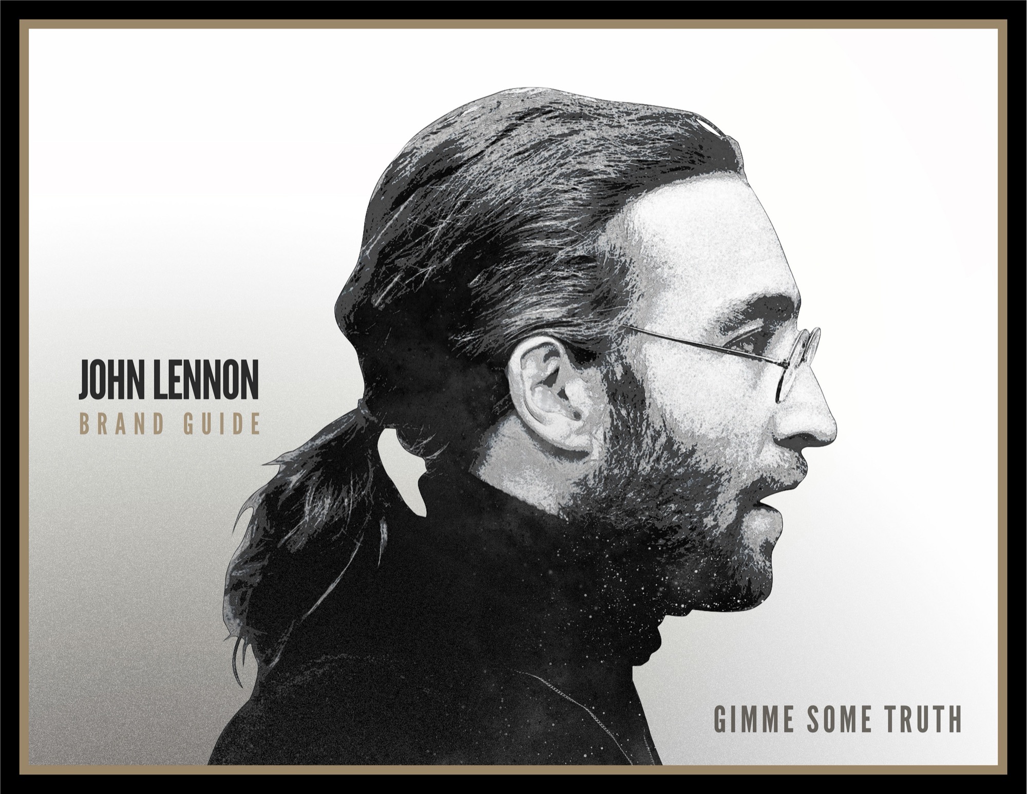
The guide cover sets the tone with a single, high-contrast profile. The crop gives Lennon’s face, glasses and silhouette most of the frame. His name and the guide title sit to the left, and Gimme Some Truth sits low on the right. That spacing lets the portrait register before the reader moves to the type.
Condensed capitals give the title the directness of a headline. A narrow gold border warms the black-and-white portrait. Inside, the same gold picks out words in section titles and sits around pages filled with color photographs and press covers. The frame and typography tie those different materials together.
03 / Putting the archive in context
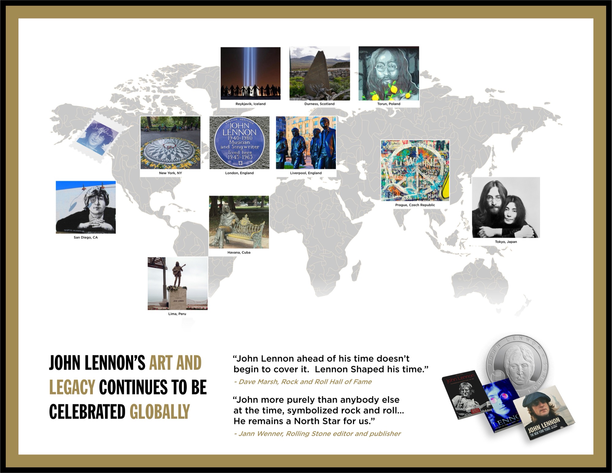
One spread maps tributes from New York and Reykjavík to Havana and Prague. The mix of public art, memorials and civic landmarks shows how differently people remember Lennon. The map gives an anniversary or commemoration team a starting point for choosing which part of that history to foreground.
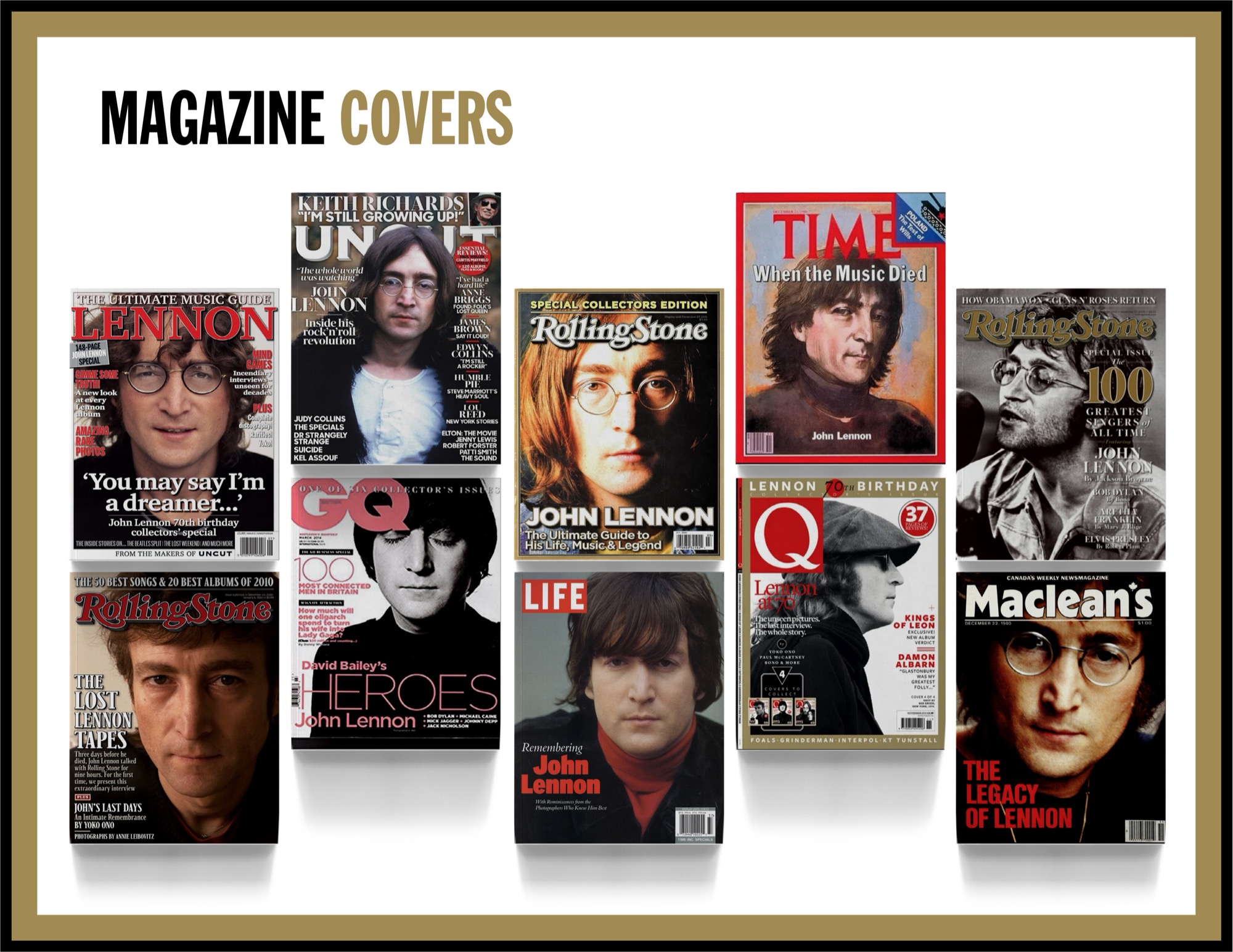
The magazine spread collects covers from Time, Rolling Stone, Life and other publications. Together they show how a close crop, a profile or a different era of photography can shift the emphasis from Lennon the musician to Lennon the public figure.
04 / How partners could use the guide
For a licensed product, the guide gave a team an identity to work from and context for choosing a portrait that fit the format. For an anniversary feature, the legacy pages offered a way to connect a photograph or tribute to a specific place or moment. For partner communications, the guide’s own pages demonstrated how type, color and spacing could hold varied material together.
The guide gave partners a common reference for two decisions: which part of Lennon’s story a piece would tell, and how the estate’s visual identity would frame it.