01 / The franchise brief
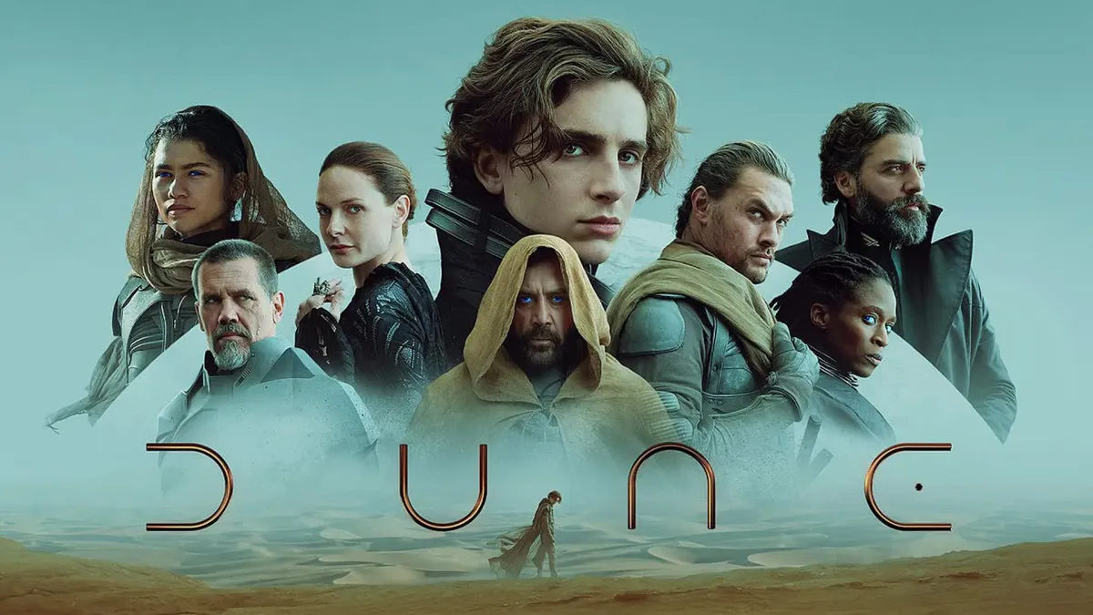
Denis Villeneuve’s adaptation of Frank Herbert’s Dune brought a world of rival houses, ritual and desert landscapes to a global film audience. For Legendary, the design challenge was to carry that world beyond the film into formats as different as a small merchandise graphic and a full campaign composition.
At BDG, I worked on art and brand architecture under Greg Berman’s creative direction. The guide organizes the work at two levels: a shared Dune identity, and a set of house symbols, character art and graphic treatments that partners can draw on for a specific story or format.
02 / Giving each house an identity
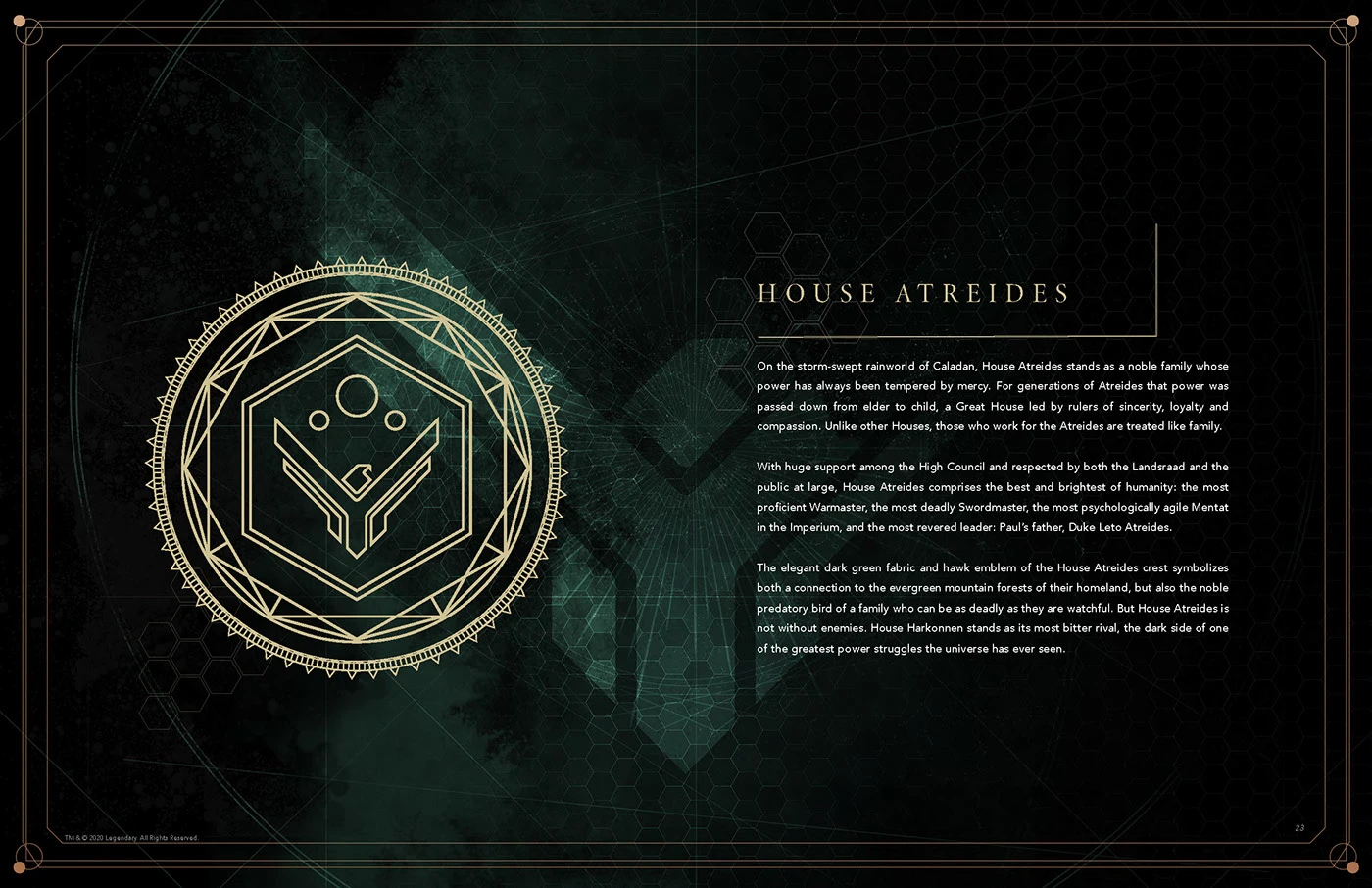
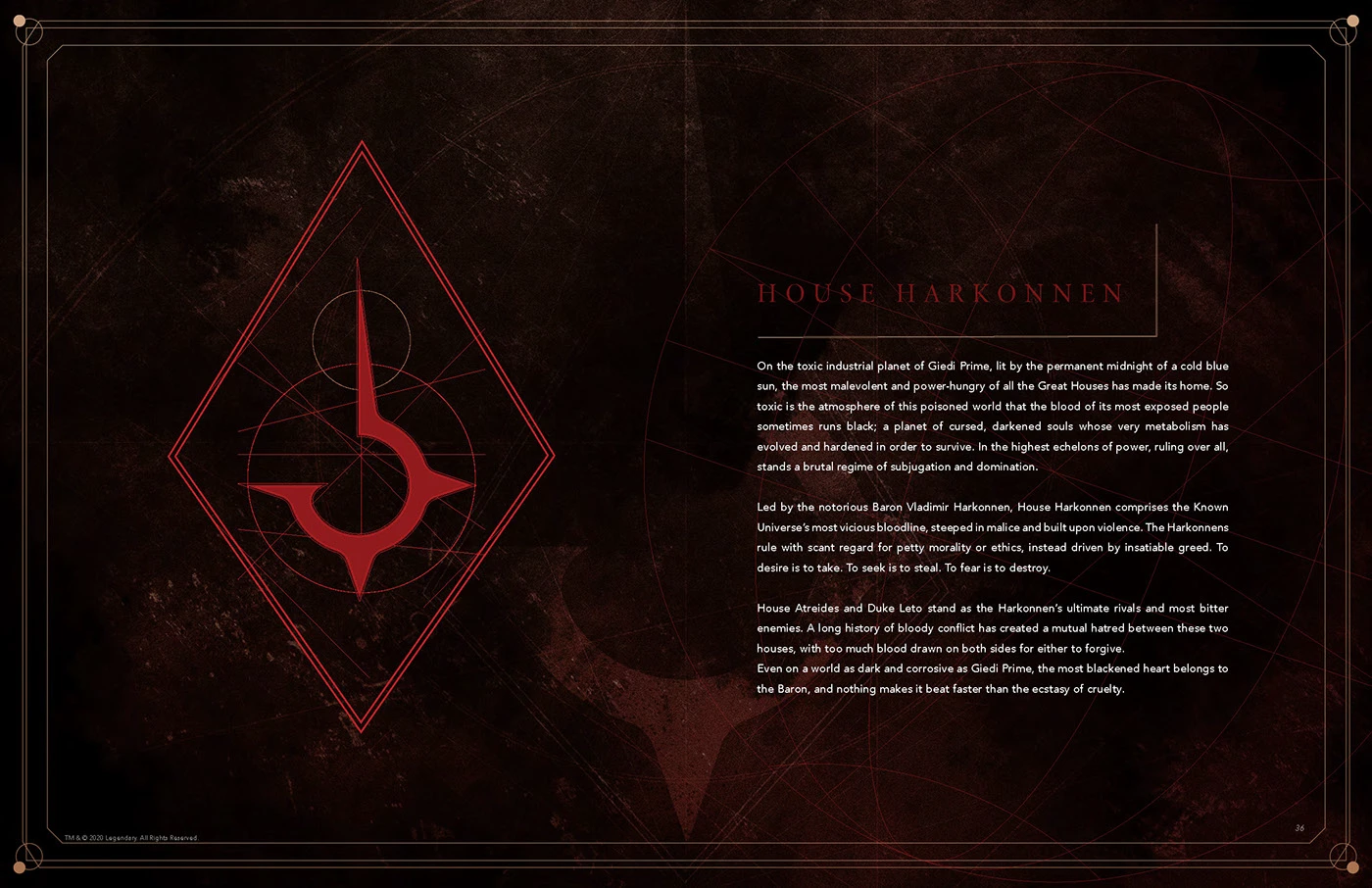
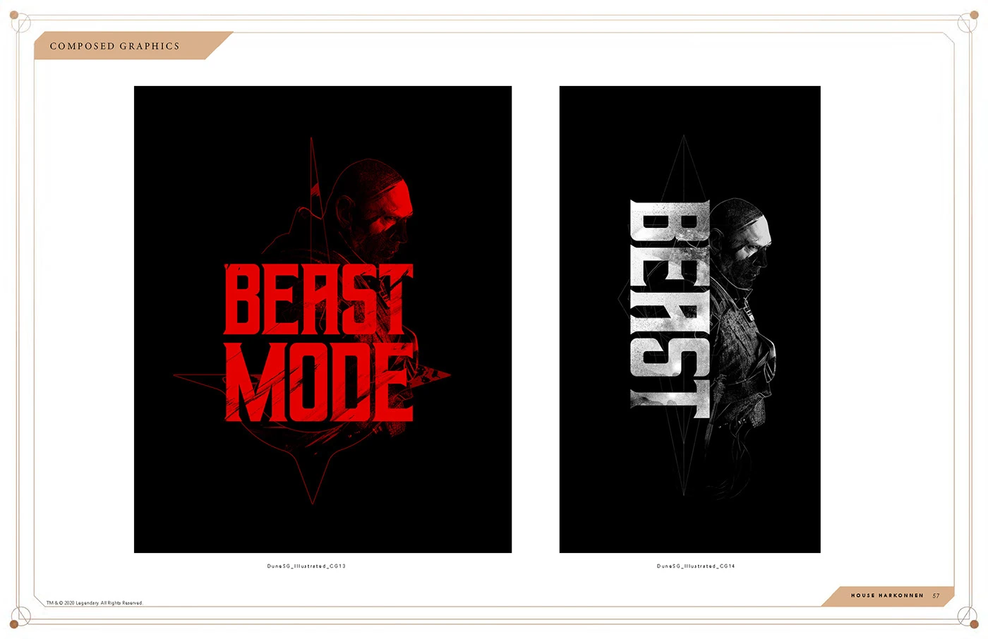
The rival houses gave the guide a way to organize Dune’s visual world. House Atreides uses a circular seal against deep green. House Harkonnen uses a red emblem framed by a sharp diamond. The shift in shape and color makes the allegiance legible even when the artwork has no character portrait or scene to establish it.
The house marks can carry a composition on their own or sit alongside character art. That gives a partner a way to make a piece feel specific to a faction while the Dune logotype and shared design standards connect it to the franchise.
03 / What stays consistent
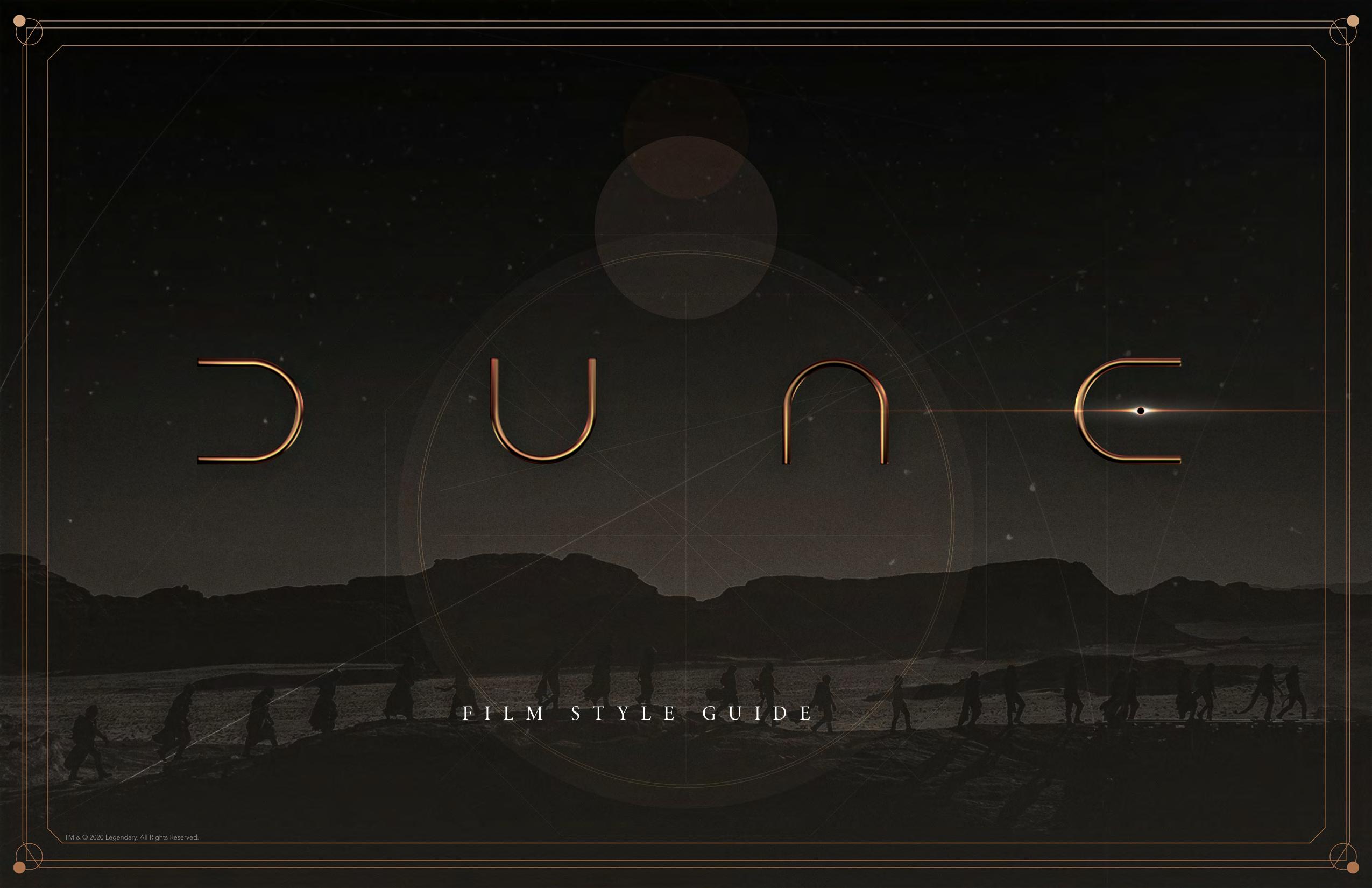
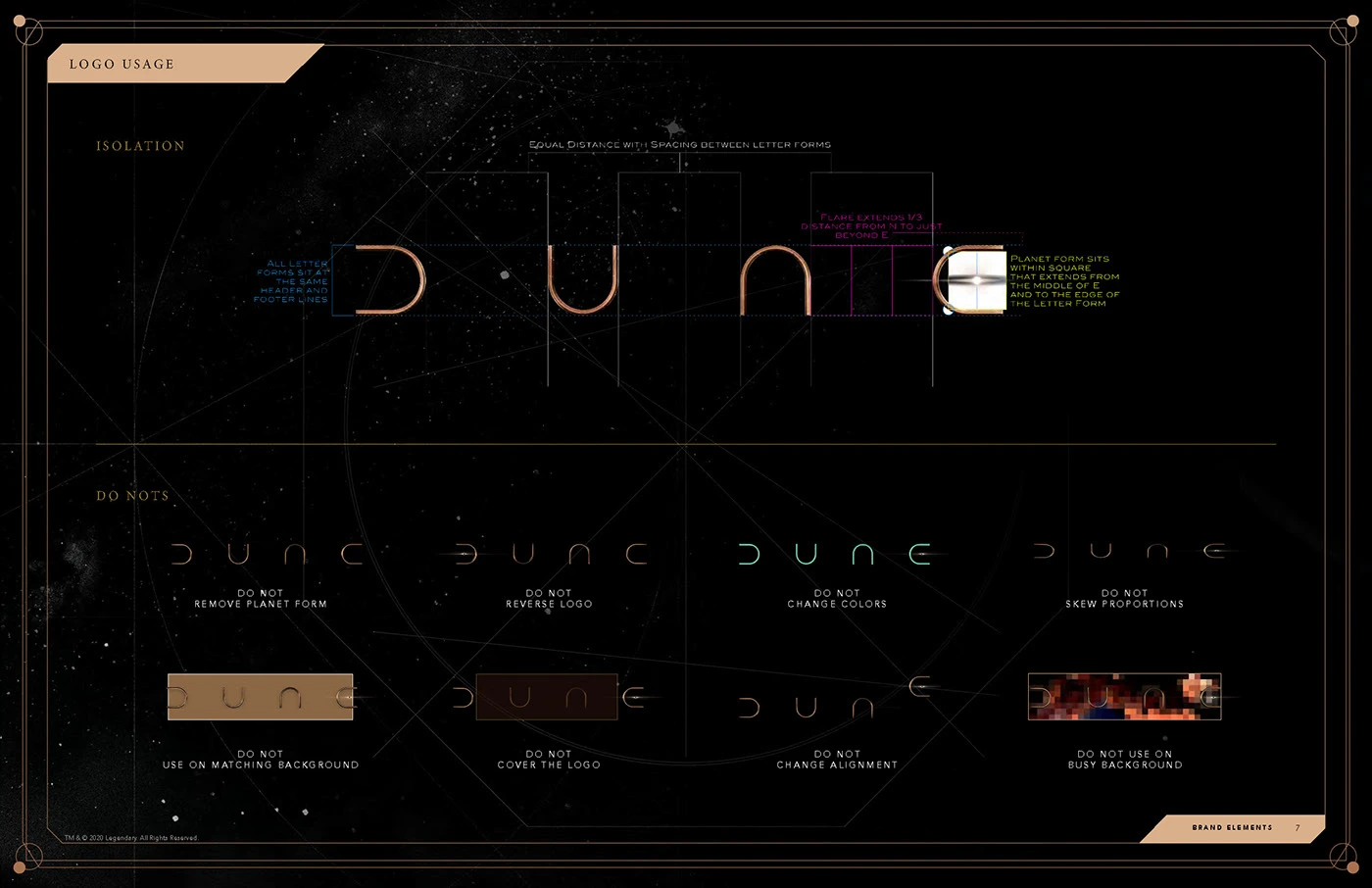
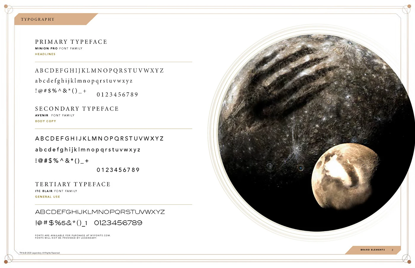
The logotype standards show how the Dune wordmark can appear over different backgrounds. The type system gives headline and supporting copy distinct roles. Together, those standards give partners a consistent way to identify and set the brand when the artwork changes.
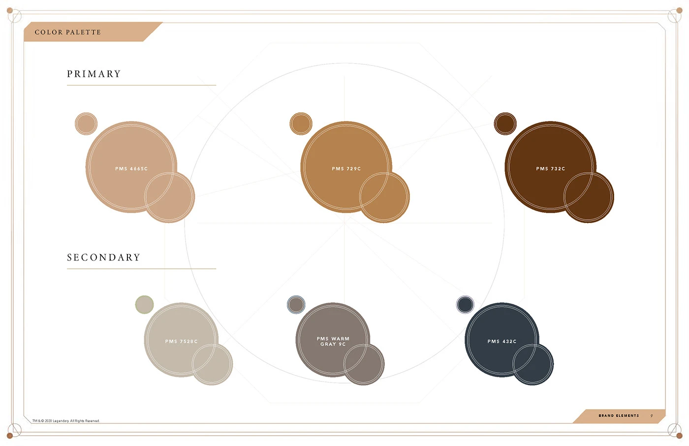
The primary palette moves from sand to deep earth tones. The secondary palette adds cooler grays and blue. The range lets a layout shift from the heat of Arrakis to the cooler atmosphere of a character or faction while keeping the color choices within the same guide.
04 / Composing character art
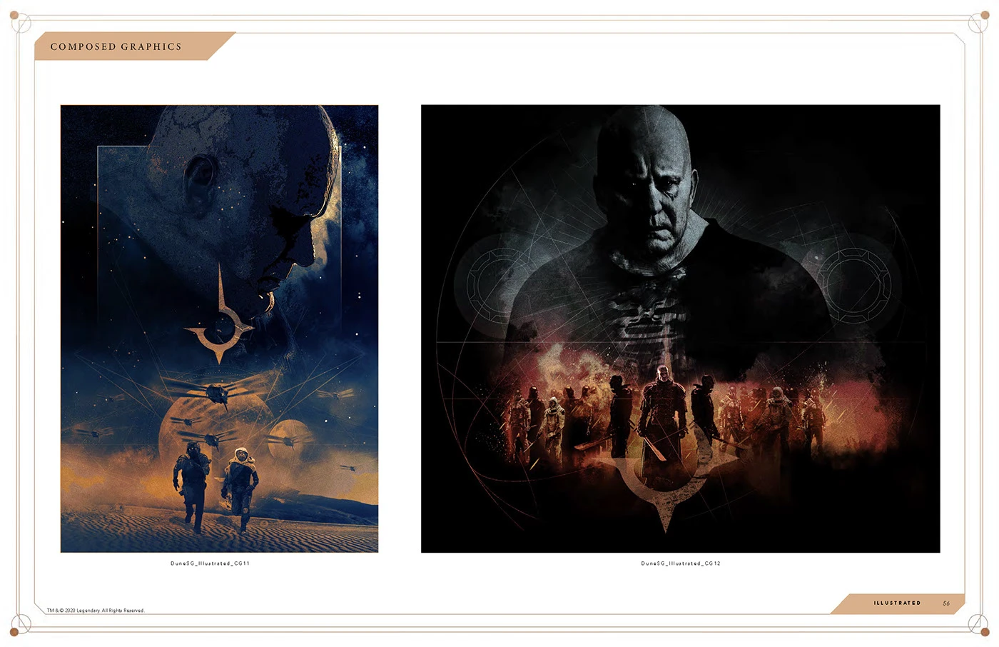
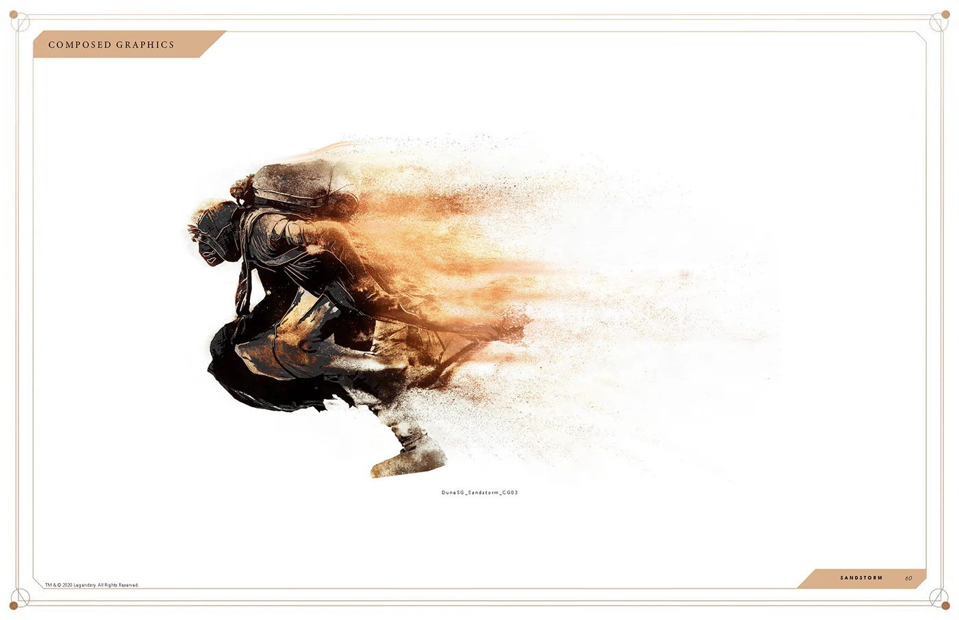
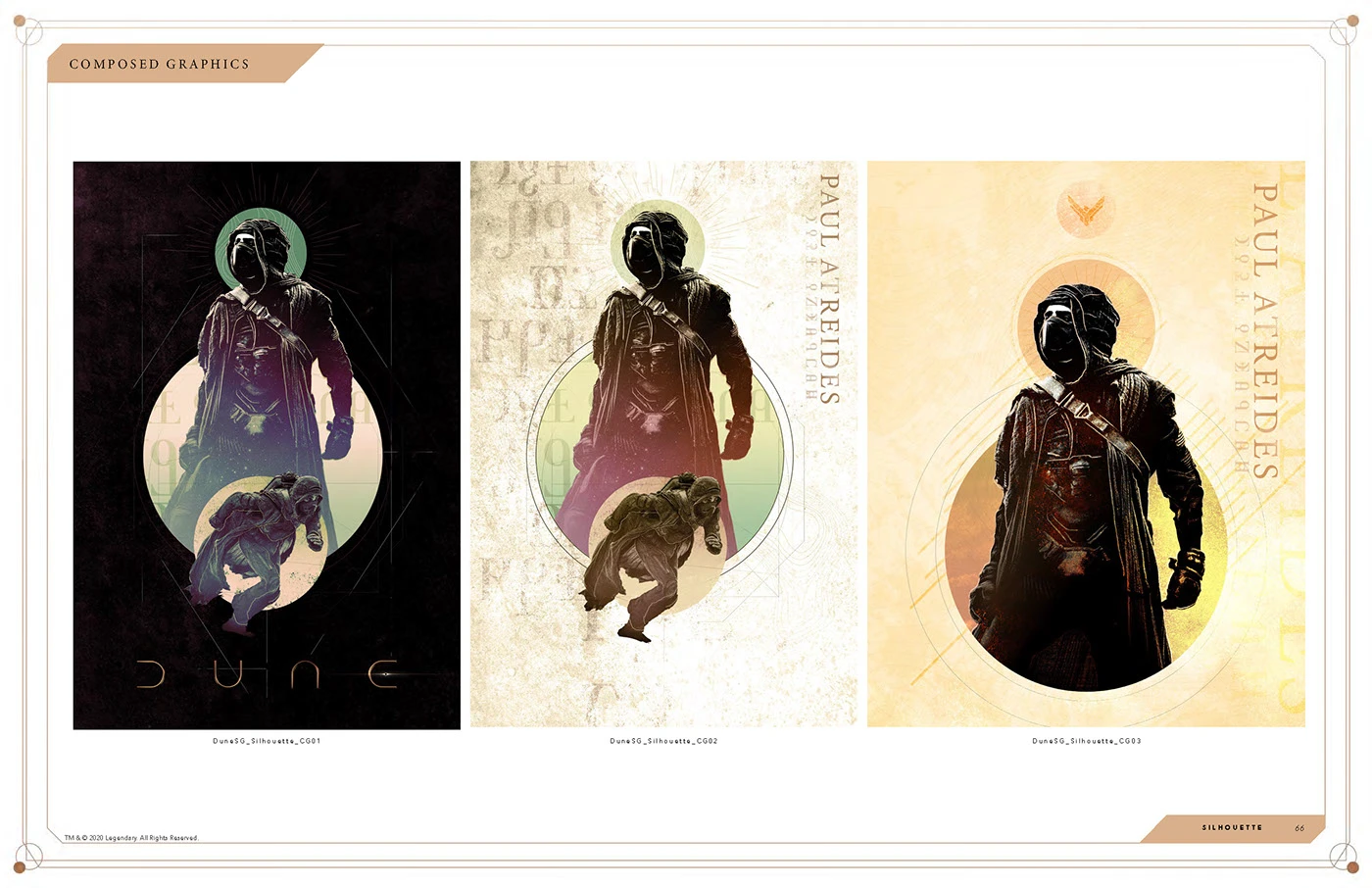
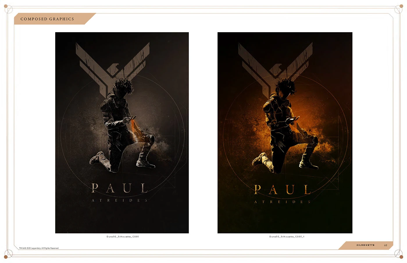
The composition studies show how much can change within the system. In one set, the figure becomes a silhouette filled with texture and imagery. In the Paul Atreides poster studies, the figure, house emblem and type hold their places as the lighting shifts. The same structure can support a quiet portrait or a composition with more heat and contrast.
That range matters when a partner needs to choose a treatment for a format. A silhouette can read quickly in a compact placement. A larger composition can use the surrounding space to show more of the world.
05 / Designing for licensees
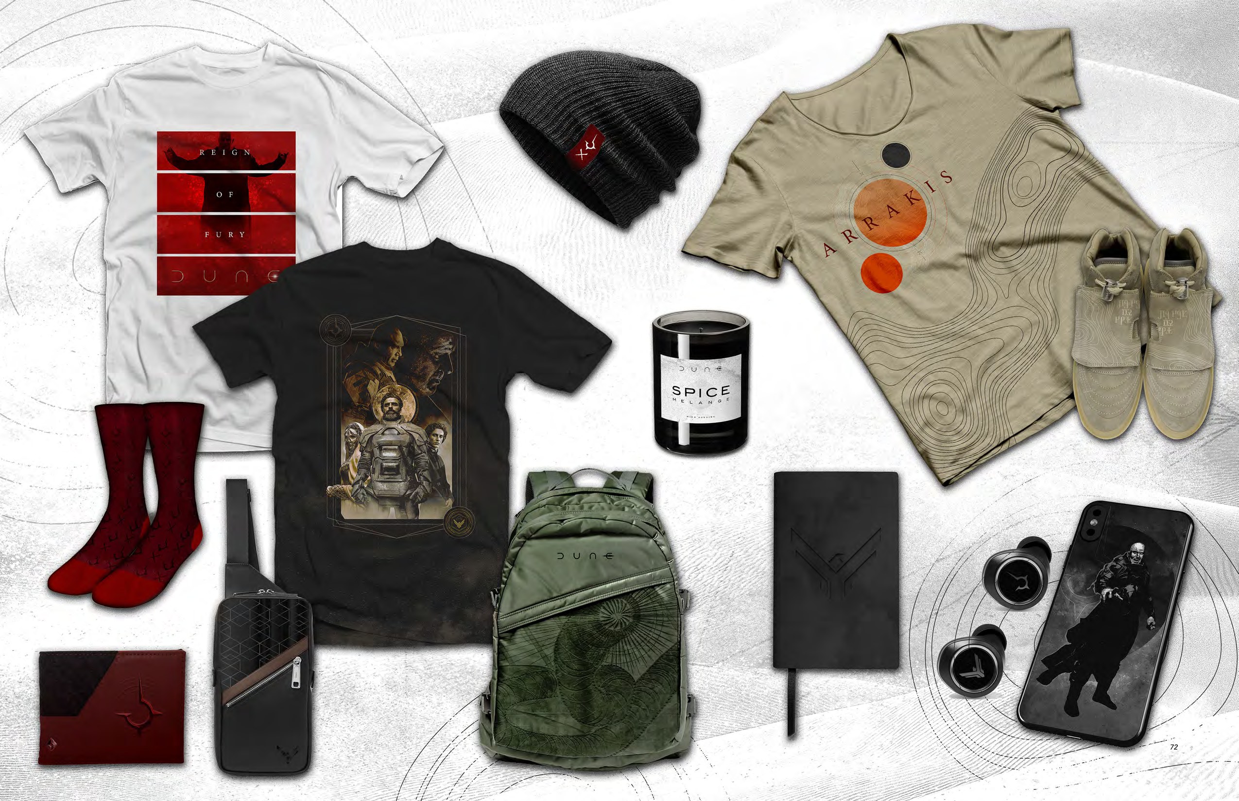
A graphic on a cap has very different demands from a print across a T-shirt. The merchandise examples show how a partner might use a single symbol on a small surface and reserve a full character composition for a larger print.
The deliverable brought those choices together in one reference: brand standards for consistency, house identities that connect the art to the story, and application studies that show how the artwork can change with the format.
Client: Legendary Entertainment. Agency: BDG.
Creative Direction: Greg Berman. Art & brand architecture: Nick Foster.